Spending Limits by Category: What the Numbers Say You Should Be Spending
Data-backed spending limits for every major expense category, based on BLS Consumer Expenditure Survey data and adjusted by income level. Includes interactive benchmark comparator.

Andrei Popescu
FinTech Product Analyst & Personal Finance Technologist
Spending Limits by Category: What the Numbers Say You Should Be Spending
"How much should I spend on groceries?" is one of the most Googled personal finance questions — and one of the least honestly answered. Most articles give you vague rules like "20% of income on food" without telling you that this number changes dramatically based on your income, location, and household size.
This article uses actual Bureau of Labor Statistics Consumer Expenditure Survey data to give you income-specific benchmarks. Then we'll tell you how to use them without turning your budget into a guilt machine.
Why Generic Budget Percentages Don't Work
The famous 50/30/20 rule (50% needs, 30% wants, 20% savings) has a major flaw: it's income-blind.
For someone earning $35,000/year in a high cost-of-living city, housing alone may consume 50-55% of take-home pay — leaving nothing for the "wants" category and making the 20% savings target literally impossible.
For someone earning $150,000/year, the 50/30/20 rule often underestimates what they should be saving relative to income.
Reality-based benchmarks need to be:
- Income-specific — what's reasonable at your income level
- Category-specific — each expense behaves differently
- Direction-setting, not rule-enforcing — benchmarks are comparison points, not mandates
callout.insight
Research from the Journal of Financial Planning shows that people who compare their spending to income-adjusted benchmarks save 23% more than those who follow generic budget percentages. Not because the benchmarks force saving — but because accurate comparison creates motivation vs. guilt.
BLS-Based Spending Benchmarks by Income Level
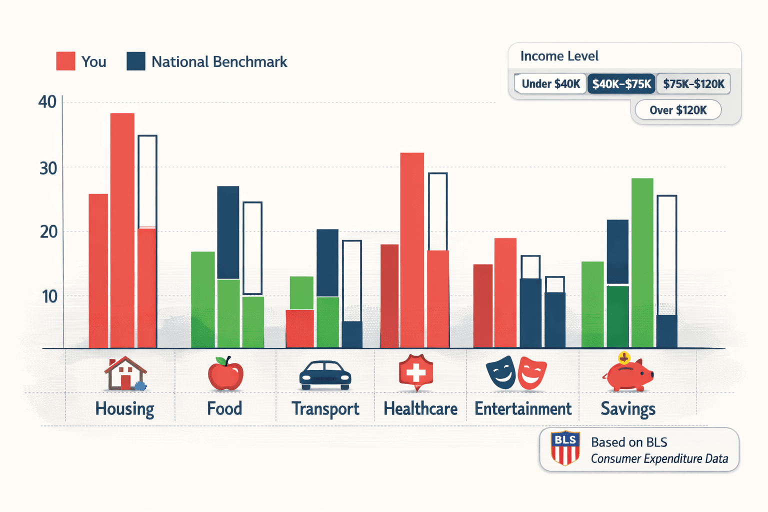
The following data is adapted from the BLS Consumer Expenditure Survey (annual), expressed as a percentage of after-tax income:
Under $40,000 Annual Income
| Category | Average % of Income | Average Monthly $ |
|---|---|---|
| Housing | 38% | $1,013 |
| Food (total) | 16% | $427 |
| Transportation | 17% | $453 |
| Healthcare | 8% | $213 |
| Entertainment | 5% | $133 |
| Savings | 4% | $107 |
| Clothing | 5% | $133 |
| Other | 7% | $187 |
At this income level, housing and transportation dominate. Savings are genuinely constrained — the benchmark shows this, rather than setting an unrealistic expectation.
$40,000 – $75,000 Annual Income
| Category | Average % of Income | Average Monthly $ |
|---|---|---|
| Housing | 33% | $1,512 |
| Food (total) | 13% | $596 |
| Transportation | 17% | $779 |
| Healthcare | 8% | $367 |
| Entertainment | 6% | $275 |
| Savings | 8% | $367 |
| Clothing | 4% | $183 |
| Other | 11% | $504 |
This is the range where intelligent budgeting has the largest impact. The gap between current spending and benchmark spending tends to be largest here — meaning the most room for improvement.
$75,000 – $120,000 Annual Income
| Category | Average % of Income | Average Monthly $ |
|---|---|---|
| Housing | 30% | $2,250 |
| Food (total) | 12% | $900 |
| Transportation | 16% | $1,200 |
| Healthcare | 7% | $525 |
| Entertainment | 7% | $525 |
| Savings | 12% | $900 |
| Clothing | 4% | $300 |
| Other | 12% | $900 |
Over $120,000 Annual Income
| Category | Average % of Income | Average Monthly $ |
|---|---|---|
| Housing | 26% | $2,600+ |
| Food (total) | 10% | $1,000+ |
| Transportation | 14% | $1,400+ |
| Healthcare | 6% | $600+ |
| Entertainment | 8% | $800+ |
| Savings | 18% | $1,800+ |
| Clothing | 4% | $400+ |
| Other | 14% | $1,400+ |
At higher incomes, the savings rate should increase significantly — but BLS data shows it often doesn't. The "lifestyle creep" problem is most visible at this level.
See How You Compare
Enter your income and actual spending to see exactly where you stand vs. national averages for your income bracket:
Budget Benchmark Tool
How Does Your Spending Compare to National Averages?
Enter your income range and monthly spending. We'll compare you against BLS national averages for your income bracket.
Enter your monthly spending by category:
Category-by-Category Guidance
Housing
Benchmark range: 26-38% of after-tax income (lower income = higher percentage)
The classic rule is "housing under 30%." This is reasonable but not universal:
- In NYC, SF, Boston: 35-45% is realistic even at moderate incomes
- In Midwest, Southeast, rural areas: 20-25% is achievable
Red flags: Over 40% of income on housing leaves little flexibility for savings or unexpected expenses. Under 20% at moderate income levels often indicates trade-offs in space, location, or condition.
Leverage point: Housing is usually fixed once you've signed a lease. The time to optimize is at lease renewal, not mid-year.
Food
Benchmark range: 10-16% of after-tax income
Food spending has two very different components:
- Groceries: More efficient, highly controllable
- Restaurants/Delivery: More expensive, habit-driven
Average US households spend approximately $300-400/month on groceries and $150-250/month on dining out. The ratio matters more than the total.
Red flags: Restaurants + delivery consistently exceeding groceries spending. Meal delivery services charging $15-20+ for items you could prepare for $4-6 at home.
Leverage point: Meal delivery is the category with the highest "immediate reduction potential." Replacing just 3 meal deliveries/week with home cooking typically saves $150-200/month.
Transportation
Benchmark range: 14-17% of after-tax income
This includes car payments, insurance, gas, maintenance, and rideshare. It's one of the most underestimated spending categories because costs are distributed across multiple expenses.
Real calculation breakdown (car owner):
- Car payment: $400-600
- Insurance: $100-200
- Gas: $100-200
- Maintenance average: $80-150
- Parking/tolls: $50-150
- Total: $730-1,300/month
Red flags: Total transport costs exceeding 20% of income. Car payment alone exceeding 10% of monthly income.
Leverage point: Car payment is often optimized at purchase. Insurance is frequently over-paid — comparison shopping annually can save $50-150/month.
Entertainment
Benchmark range: 5-8% of after-tax income
This category often surprises people when they actually track it. Streaming subscriptions, concerts, sports, hobbies, books, apps — these add up to far more than most people estimate.
The "subscription audit" test: Total all subscriptions (streaming, gaming, apps, gym memberships, news). Most people discover 2-4 subscriptions they'd forgotten about.
Red flags: Entertainment routinely exceeding 10% of income without conscious choice. "Subscription creep" — subscriptions accumulated over years that are rarely used.
Tip
Every 3 months, cancel every subscription. Then re-subscribe only to the ones you actually miss. This exercise typically identifies 2-3 subscriptions worth $20-50/month that you no longer use.
Healthcare
Benchmark range: 6-8% of after-tax income
Healthcare spending is the most unpredictable category. The benchmark represents average spending but masks the variance — most months you spend little; then one month includes a procedure or emergency and costs jump significantly.
Strategy: Maintain an HSA (Health Savings Account) if eligible. This creates a tax-advantaged way to handle both regular and emergency healthcare costs without distorting your monthly budget tracking.
Savings
Benchmark range: 4-18% of after-tax income (scales with income)
This is where benchmarks matter most. BLS data reveals a disturbing pattern: as income increases past $75,000, the savings rate in percentage terms doesn't increase proportionally. Spending expands to fill available income.
Income-specific savings targets:
- Under $40k: 4-8% (anything saved is meaningful)
- $40k-$75k: 8-15% (building toward real financial security)
- $75k-$120k: 12-20% (this is where wealth accumulation accelerates)
- Over $120k: 18-25%+ (where 30-year financial independence becomes achievable)
Red flags: Savings below 5% at any income level (except genuine crisis periods). Savings that only happen after all other spending is settled rather than being automated at the start of the month.
How to Use These Benchmarks (Not Abuse Them)
The purpose of benchmarks is calibration, not judgment.
If your housing is at 38% instead of 26%, don't panic. That might be completely appropriate given your location, income, or life stage. The question isn't "am I at the benchmark?" — it's "do I understand why I'm where I am, and does it align with my priorities?"
A spending category that's above benchmark because you've consciously decided it matters to you is fine. A spending category that's above benchmark because you've never looked and it just happened is worth addressing.
The practical three-question framework:
- Is this above or below benchmark for my income?
- If above: is this a conscious choice or unconscious drift?
- If unconscious drift: what specific behavior could I change?
Question 3 is where actual change happens. Not from the comparison itself, but from the specific, behavioral answer to it.
callout.insight
Research shows that spending categories tied to identity (the "I'm a foodie" person's restaurant budget, the "I'm a traveler" person's vacation budget) resist reduction the most — even when far above benchmark. Simply knowing this helps. When a benchmark comparison triggers defensiveness, that's the category worth examining most carefully.
FAQs
Q: These benchmarks use percentages of income — what counts as "income"?
After-tax take-home income. Not gross income. If your paycheck is $4,000/month after taxes, that's your baseline, not your $5,600 gross.
Q: The benchmarks for my income level show I can't save much. Is that accurate?
At lower income levels, yes — structural constraints are real. Focus on reducing the highest-discretionary categories first (dining out, subscriptions, impulse shopping) and treat even small savings as genuine wins. The goal is to improve your ratio, not hit an impossible percentage.
Q: How often should I compare my spending to benchmarks?
Monthly comparison is ideal. You'll notice seasonal patterns (entertainment spikes in December, travel spikes in summer) that are normal vs. structural overspending that needs addressing.
Q: My city is much more expensive than the national average. Does that affect the benchmarks?
Significantly. Housing in San Francisco or New York will be 40-60% higher than the national average. Local benchmarks (your city's specific data) are more useful than national benchmarks for housing and transportation. National benchmarks are more applicable for food, entertainment, and savings.
Q: What's the fastest category to cut if I need to save more immediately?
Meal delivery and dining out. The math is unambiguous: $15-25 for a delivered meal vs. $4-7 to make it yourself. Replacing 5 meal deliveries per week with home cooking saves approximately $2,000-3,000 per year.